
Color vision deficiency affects approximately 300 million people worldwide. Yet countless websites still rely solely on color to convey critical information, creating unnecessary barriers for a significant portion of users.
When you design with color vision deficiency in mind, you improve clarity, reduce confusion, and ensure your content reaches its intended audience effectively.
We’re going to walk you through the essential principles of colorblind-accessible design, covering the different types of color vision deficiency, key design considerations, testing methods, and practical strategies to make your website truly accessible to all users.
Get matched with the developer
that is perfect fit for your WordPress or WooCommerce needs.
Start a project
What is color blind accessibility?
Colorblind accessibility is the practice of designing digital content that can be used and understood by people with any form of color vision deficiency.
The fundamental principle isn’t to eliminate color from your designs – color remains a powerful tool for creating engaging, intuitive interfaces. Instead, the goal is ensuring that color is never the sole method used to convey important information, indicate an action, or distinguish visual elements.
This approach is vital on multiple levels. Ethically and legally, web accessibility represents a commitment to inclusivity and often constitutes a legal requirement under regulations like the Americans with Disabilities Act and Section 508, which protect against discrimination in digital spaces.
From a business perspective, an inaccessible website excludes large swathes of potential users worldwide – a substantial market that competitors with accessible sites can capture.
Beyond the immediate user base, accessible design principles typically improve usability for all visitors, often resulting in better conversion rates, reduced support costs, and enhanced brand reputation among increasingly accessibility-conscious consumers.
What types of color blindness exist?
Each type of color blindness creates specific challenges that can significantly impact how users navigate and interact with websites.
Red-green color blindness represents the most common form. This category includes deuteran-type conditions (green deficiency), where deuteranomaly makes greens appear more red, and deuteranopia eliminates green perception entirely.
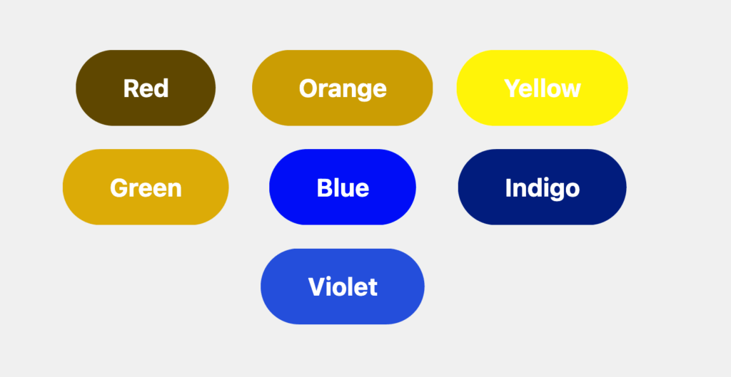
Protan-type conditions (red deficiency) cause protanomaly to make reds look more green and less bright, while protanopia renders reds as dark or black.
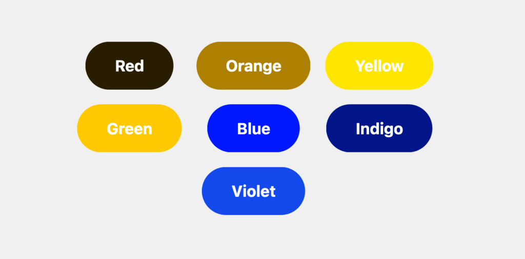
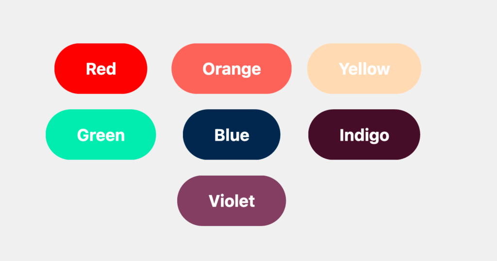
Blue-yellow color blindness occurs less frequently but creates distinct challenges. Tritan-type conditions, including tritanomaly and tritanopia, cause confusion between blue and green, as well as yellow and pink combinations.
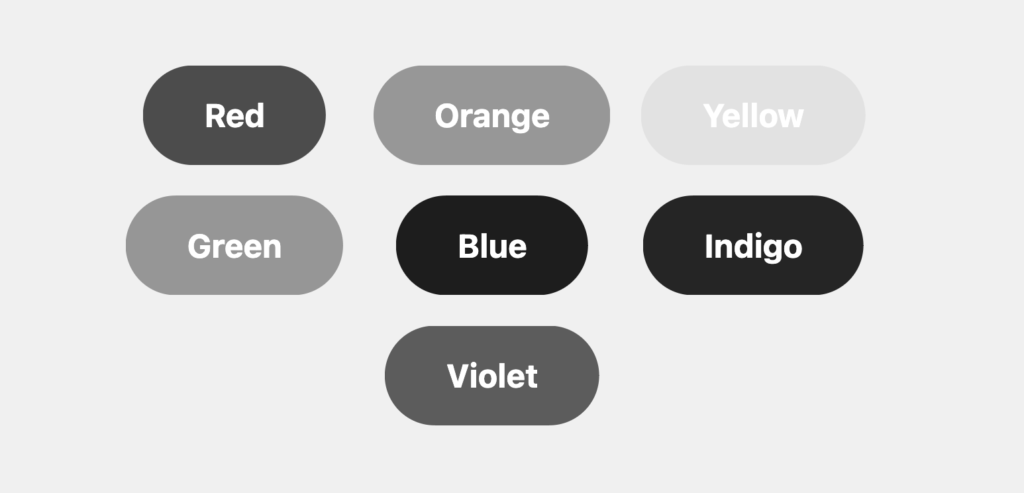
Monochromacy, the rarest form, leaves individuals seeing the world in grayscale shades only.
These conditions create significant “experience gaps” on poorly designed websites. The design flaws lead to significant accessibility barriers, including:
- Links that rely solely on color become invisible against body text.
- Red error messages or form field borders become indistinguishable from standard text, preventing users from completing essential tasks.
- Data visualizations using color-coded elements – red versus green pie chart sections or traffic light-style status indicators – become completely unreadable, forcing users to abandon sites or miss critical information entirely.
What elements are most important to design with color blind accessibility in mind?
Certain UI components consistently cause accessibility failures when designers rely solely on color to convey meaning:
- Links require non-color differentiators to remain identifiable. Underlining remains the universal standard, though other methods like bold text or distinctive borders work when applied consistently throughout the site.
- Forms and error validation present frequent barriers. Required fields should include asterisks or text labels like “Required” rather than color alone. Error states must combine descriptive text and icons with any color changes – a red outline becomes meaningless without accompanying explanatory text and visual indicators.
- Buttons and calls-to-action need multiple visual cues beyond color. Both the button boundary and text must meet contrast requirements, while bold typography, thicker borders, and relevant icons help distinguish primary actions from secondary elements.
- Data visualizations should incorporate patterns, textures, direct labels, and varied shapes or line styles instead of color-coded legends. This approach makes charts and graphs readable regardless of color perception abilities.
- Status indicators and notifications must pair color cues with corresponding icons – green success states need checkmarks, while red errors require warning symbols to communicate their meaning effectively.
Expert approaches to color blind accessibility design
Moving beyond identifying problem areas, successful colorblind accessibility requires systematic design strategies that create resilient, inclusive experiences from the ground up:
Build a resilient color palette by avoiding problematic combinations that commonly cause confusion. Red and green pairings create barriers for the vast majority of colorblind users, while green and brown combinations present similar challenges.
Instead, prioritize colorblind-friendly palettes using blue and orange combinations, which remain distinguishable across most forms of color vision deficiency. Focus on high contrast in brightness values rather than relying solely on hue differences – this approach benefits both colorblind users and those viewing content in varying lighting conditions.
Use redundant cues throughout your interface design. Information should never depend on color alone – incorporate patterns, textures, icons, and explicit text labels as backup communication methods. A successful design allows users to understand functionality and meaning even when viewing the interface in grayscale.
Adhere to WCAG standards by implementing key accessibility criteria.
- WCAG 1.4.1 (Use of Color) prohibits using color as the sole method of conveying information.
- WCAG 1.4.3 (Contrast Minimum) requires 4.5:1 contrast ratios for normal text and 3:1 for large text.
- WCAG 1.4.11 (Non-text Contrast) mandates 3:1 contrast ratios for UI components like buttons, form fields, and interactive elements – ensuring these remain visible regardless of color perception abilities.
Practical colorblind accessibility implementation in WordPress
WordPress sites offer unique opportunities and challenges for implementing colorblind accessibility. Improving an existing site or building accessibility into a new theme allows the platform’s flexibility to support both quick fixes and comprehensive solutions.
Retrofitting existing sites: Fixing forms and navigation without starting over
Targeted improvements can significantly enhance accessibility without requiring complete redesigns. For links, a simple custom CSS snippet can enforce underlined styling within post content, overriding theme defaults that rely solely on color:
.entry-content a:not(.wp-block-button__link) {text-decoration: underline;text-underline-offset: 2px;}
Form validation improvements require plugin-specific approaches. For Contact Form 7, for example, use PHP filter hooks like wpcf7_validate_email* to add descriptive icons and text alongside error styling. WooCommerce checkout validation benefits from the woocommerce_after_checkout_validation hook, allowing you to supplement error notices with clear icons and explanatory text that don’t depend on red borders alone.
While these fixes prove effective for immediate improvements, complex retrofits involving deeply nested theme or plugin conflicts often benefit from Codeable’s WordPress accessibility experts, who can ensure comprehensive, robust solutions.
Building for longevity: Integrating accessibility into your WordPress theme
Systematic accessibility requires theme-level integration rather than piecemeal fixes. CSS custom properties and design tokens within theme.json create centralized, accessible-by-default color and typography systems. This approach ensures consistency while simplifying future updates and maintenance.
Theme customization through functions.php allows developers to modify output systematically – adding accessibility features to navigation menus, post metadata, and interactive elements without touching core templates.
Framework-specific approaches leverage existing architectures. For instance, Genesis‘s hook-based system enables developers to use filters for modifying output while preserving update compatibility. Astra provides “accessibility-ready” features with extensive hooks and filters that facilitate compliance-focused customizations.
These advanced implementations represent the specialized domain where Codeable experts excel – delivering deep, theme-level accessibility solutions for complex WordPress environments that require sustained, professional-grade accessibility compliance.
How to test your website for color blind accessibility
To test whether your site is accessible to colorblind users, start with the most revealing test possible: switch your monitor to grayscale mode or use your operating system’s accessibility settings to remove all color from your display.
Now navigate your website. Can you still identify form errors? Distinguish between different navigation states? Interpret your data visualizations? The immediate, visceral experience reveals accessibility gaps that numbers alone cannot capture – and demonstrates exactly what millions of users face daily.
Effective colorblind accessibility testing requires a systematic approach that combines quantitative measurement with qualitative experience evaluation. Our three-tier workflow ensures comprehensive validation at every stage of development:
- Quantitative checks form the foundation of accessibility validation. Use color contrast checkers during the design phase to verify WCAG compliance numerically, ensuring your color choices meet minimum standards before development begins.
- Qualitative simulation brings those numbers to life during development. Color blindness simulators let you experience your site from affected users’ perspectives, revealing where meaning gets lost despite technically compliant contrast ratios.
- User feedback represents the ultimate validation. No simulation perfectly replicates the lived experience of color vision deficiency – direct feedback from users with CVD provides insights that automated tools and simulations cannot match.
The right testing tools transform accessibility from guesswork into precise, measurable improvement. These categories cover everything from initial design validation to comprehensive user experience simulation:
- Color contrast checkers provide the numerical foundation for accessibility compliance. The WebAIM Contrast Checker offers quick, reliable ratio calculations, while TPGi’s Color Contrast Analyser (CCA) provides desktop-based testing with advanced features. Design-focused tools like Stark integrate directly into design workflows, enabling real-time contrast validation.
- Color blindness simulators reveal how your designs actually function for affected users. Modern browsers include powerful built-in simulators – Microsoft Edge and Firefox offer comprehensive CVD simulation within their developer tools. Browser extensions like Colorblindly and Let’s Get Color Blind enable real-time testing on live sites without switching tools. Standalone applications like Color Oracle and Coblis simulate CVD across entire screens or uploaded images, perfect for comprehensive design review sessions.
Ensure your site is color blind accessible with Codeable
While understanding accessibility principles provides a solid foundation, comprehensive colorblind accessibility often requires specialized expertise beyond basic fixes.
Codeable operates as a curated marketplace exclusively for top-tier WordPress developers, accepting fewer than 2% of applicants through a rigorous 6-step vetting process.
Codeable experts provide specialized services, including comprehensive accessibility audits, complete site remediation to achieve WCAG standards, and ongoing maintenance. Rather than treating accessibility as an afterthought, these professionals integrate accessibility into fundamental site architecture.
When hiring, be explicit about compliance requirements – specify something like “WCAG 2.1 Level AA compliance” in your brief and request examples of past accessibility work.
Professional implementation differs fundamentally from automated solutions. While accessibility widgets offer superficial overlays, expert developers provide deep, structural fixes that address root causes and create sustainable accessibility frameworks.
Submit your project to Codeable when you’re ready to make your WordPress site truly accessible!

20 000+ businesses of every shape and size have already trusted us to hire WordPress developers and scale their growth.
 Dream It
