Do you know that your website might have an invisible ‘Keep Out’ sign? It’s an easy mistake to make – in fact, an incredible 94.8% of the world’s top homepages failed basic accessibility criteria in 2025. This common oversight creates two serious problems: a rising number of expensive ADA lawsuits and a missed connection with 1.3 billion potential users with disabilities.
For many well-intentioned teams, the path to an accessible website can seem daunting. It often brings to mind dense compliance checklists and a persistent myth that achieving accessibility means sacrificing clean design and a dynamic user experience.
But that’s not true..
The most forward-thinking organizations show us that accessibility and exceptional design go hand-in-hand. In this article, we’ll move past theory into practice and explore stunning, real-world web accessibility examples that masterfully blend form with function.
Discover exactly how to build a better, more welcoming front door for your own online space.

Get matched with the developer
that is perfect fit for your WordPress or WooCommerce needs.
Start a project
Brief summary of accessible web design principles
To build a website that welcomes everyone, it helps to have a map. The Web Content Accessibility Guidelines (WCAG) provide this map. These guidelines are not strict rules, but rather the foundation for creating a better online experience for all your users. The principles are organized around a simple acronym: POUR.
Core WCAG principles
POUR stands for Perceivable, Operable, Understandable, and Robust. It’s a framework that helps ensure no one is left behind.
| Principle (POUR) | What it means | Key actions |
| Perceivable | Information must be presentable in ways that users can sense and process. | Provide text alternatives for non-text content (e.g., alt text for images).Ensure sufficient color contrast (minimum 4.5:1 for normal text).Make content adaptable to different views (e.g., text resizing). |
| Operable | The interface and navigation must be usable by everyone, with any device. | Allow full keyboard accessibility for all interactive elements.Avoid “keyboard traps” where users can’t navigate out of a section.Give users enough time to read and use content.Avoid content known to cause seizures (e.g., flashing content). |
| Understandable | Information and the user interface should be clear and easy to follow. | Use clear, simple language and consistent navigation.Ensure pages operate in predictable ways.Help users avoid and correct mistakes with clear error messages. |
| Robust | Content must work reliably with a wide variety of browsers and assistive technologies. | Use semantic HTML as the foundation.Ensure compatibility with current and future assistive tools.Validate code and follow web standards. |
Key technical implementation strategies
Putting the POUR principles into practice involves a combination of smart coding and thoughtful testing. Developers use several key strategies to build accessible websites from the ground up, including:
- A semantic HTML structure with a proper heading hierarchy (<h1> followed by <h2>, etc.) creates a logical outline of the page for screen readers.
- Using ARIA (Accessible Rich Internet Applications) attributes adds extra context for dynamic content like pop-up menus or live chat windows, which might otherwise be invisible to assistive tech.
- Implementing proper focus management ensures that keyboard users can easily tell which element is currently selected, especially in complex single-page applications.
- Following a progressive enhancement approach means starting with a simple, core experience that works for everyone, then adding more advanced features on top.
- Integrating automated accessibility testing into the development pipeline helps catch common errors early and often.
- Conducting manual expert audits is necessary for evaluating complex interactions and user flows that automated tools might miss.
- Performing user testing with people with disabilities provides direct feedback on what is and isn’t working, offering the clearest picture of your site’s real-world accessibility.
10 websites that excel at web accessibility
Theory and guidelines are helpful, but seeing accessibility in action provides the clearest lessons. The following websites are excellent examples of how to weave accessibility into the fabric of design. Here are 10 sites that get it right!
1. GOV.UK – Government excellence
GOV.UK, the UK’s government website, is a model of accessible design. It’s designed on the principle that public information is a right, and therefore must be available to every citizen, proving that simplicity and a user-first focus are the keys to success. Instead of flashy features, GOV.UK gets the fundamentals right.
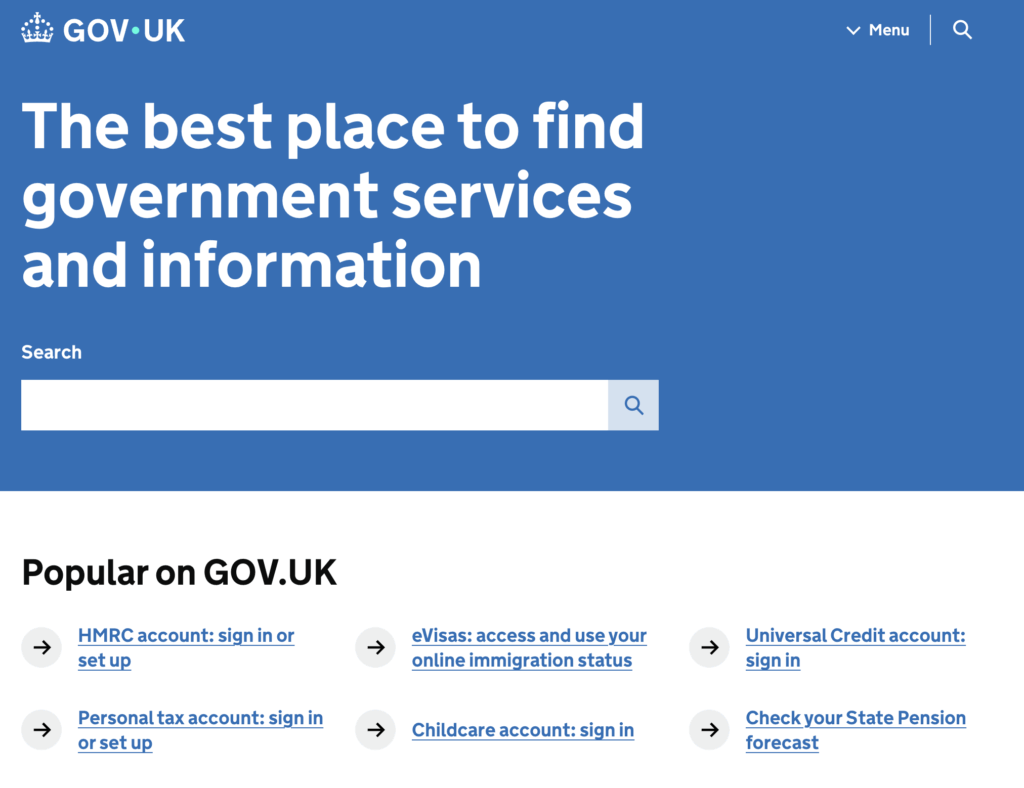
Here’s why it works so well:
- Radical transparency. The site publishes detailed accessibility statements. They openly list known problems and when they plan to fix them, which builds user trust.
- Efficient keyboard navigation. A clear breadcrumb navigation menu is the first item on every page. This saves screen reader users from navigating the entire header every single time.
- A rock-solid structure. It uses clean, semantic HTML. Proper use of elements like <main> and <nav> creates a logical and predictable map for assistive technologies.
- Commitment to plain language. The site avoids jargon and uses simple sentences. This supports cognitive accessibility and helps everyone find what they need quickly.
- Built to be reliable. Its core services work even if JavaScript fails. This ensures everyone can access vital information, regardless of their device or connection speed.
Clarity is the foundation of accessibility here. A simple, predictable experience is often the most effective design for all users.
2. BBC – Dynamic content mastery
While some websites deal with static information, global news outlets like the BBC face a different challenge: managing a massive amount of content that changes by the minute. Making a constantly updating site with live tickers, video players, and sprawling sections accessible is a complex task. The BBC solves this with smart technical choices and a well-structured site.
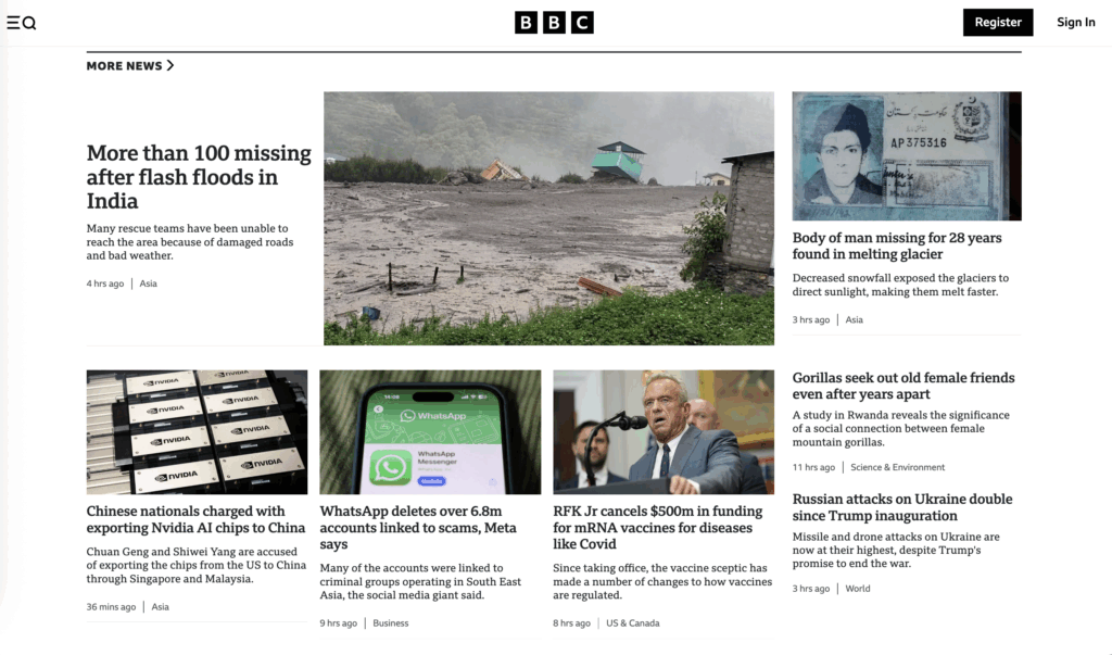
Here is how they make their dynamic site accessible:
- Advanced support for modern web features. The site makes extensive use of ARIA (Accessible Rich Internet Applications). These are special attributes in the code that act as signposts for screen readers. When a news ticker updates or a new element loads on the page without a full refresh, ARIA tells the assistive technology what happened, ensuring a visually impaired user doesn’t miss out.
- Intuitive and predictable keyboard control. The entire site is operable with just a keyboard. Users can reliably use standard keys like Tab and Enter to navigate and interact with all content, providing an experience that is equivalent to using a mouse.
- Public compatibility statements. The organization publishes compatibility statements for major screen readers like JAWS, NVDA, and VoiceOver. By testing and verifying how their site performs with these tools, the BBC gives users the confidence that the site is designed and maintained with their needs in mind.
- Clear section navigation. On a site with so much content, getting lost is easy. The BBC uses ARIA landmarks and roles to define different regions like “navigation,” “main content,” and “complementary.” This allows a screen reader user to get a quick overview of the page and jump directly to the section they care about, such as skipping from the main headlines to the sports section.
- An open feedback channel. A dedicated email address makes it easy for users to report accessibility barriers, showing a commitment to continuous improvement.
The key takeaway from the BBC website is that complexity can be managed with a strong information architecture. They demonstrate that even the most dynamic, content-heavy websites can be made accessible when a logical, well-structured foundation is in place.
3. Apple – Innovation through inclusion
For many companies, accessibility is a matter of compliance. For Apple, it’s a core part of its brand identity and a driver of innovation. Their website, like their products, is designed with the belief that technology should empower everyone. This philosophy is evident in how they present their features not as technical add-ons, but as tools that change people’s lives.
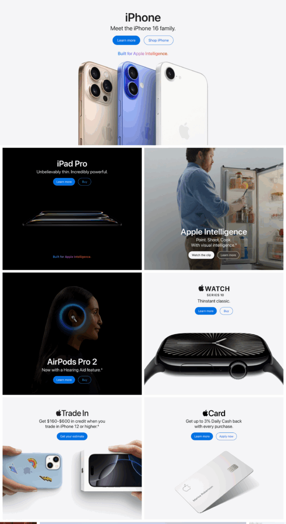
Apple’s approach provides a powerful lesson in making accessibility a central part of your mission:
- Accessibility as a human right. Apple frames accessibility as a core value, not a legal chore. This shifts their entire approach from simple ADA compliance to user empowerment.
- Focus on human stories. The site showcases how features empower real people. It showcases tools like VoiceOver for users who are blind, Eye Tracking for those with physical motor limitations, and Assistive Access for individuals with cognitive disabilities, often through stories of real people. This makes the benefits of their accessible technology tangible and easy to understand.
- Design accessibility from the start. Apple’s public Human Interface Guidelines, which set the standard for app development on their platforms, demand that accessibility be considered from the very beginning of the design process. This ensures that inclusive design is not an afterthought but a foundational requirement.
- Flexible and readable text. The site’s layout adapts gracefully when users enlarge text. This ensures the content never breaks or becomes unreadable for people with low vision.
- Communicating without relying on color alone. While the site has a clean and colorful aesthetic, it never uses color as the only way to convey important information. For instance, link indicators, error messages, and alerts are always accompanied by icons, text, or other visual cues, making them clear to users with color blindness.
Apple effectively demonstrates the power of framing, treating accessibility as a source of innovation and a tool for human empowerment. This approach not only creates better products for users with disabilities but also strengthens the brand’s connection with all of its customers.
4. Patagonia – Mature governance approach
Patagonia is a brand built on a strong ethical foundation, known globally for its commitment to environmental responsibility. They apply this same serious, structured approach to digital inclusion, demonstrating a mature understanding that true accessibility requires partnerships with outside experts to ensure accountability and excellence.
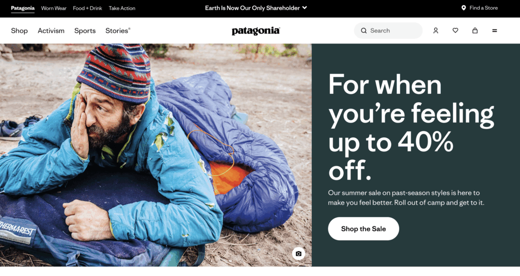
Patagonia’s governance-led approach offers a great model for businesses:
- A clear and public commitment to standards. Patagonia openly states its goal to meet WCAG 2.1 Level AA. This creates a clear and public benchmark for their work.
- Bringing in third-party expertise. Recognizing the complexity of accessibility, Patagonia partners with Level Access, a specialized accessibility firm, for audits and support. This shows a serious commitment to getting it right.
- Free assistive technology for customers. Going a step beyond simple compliance, Patagonia offers its customers a free assistive technology application. This tool provides features like text-to-speech, screen magnification, and other aids directly on their site, proactively helping users who may not have their own assistive tools.
- Support for hands-free navigation. The site includes options for voice recognition and other hands-free navigation methods. This directly benefits users with physical and motor disabilities who cannot rely on a traditional keyboard or mouse to browse and shop.
- Clarity in the shopping experience. Clean product pages and straightforward sizing guides reduce cognitive load. This makes the process of finding the right product simpler and less stressful for all users, including those with disabilities.
Patagonia shows that a mature accessibility strategy involves holding yourself accountable, and that one of the best ways to do this is by forming partnerships with external experts to guide and validate your work.
5. Scope UK – Living the mission
As a disability equality charity in the UK, Scope’s mission is woven into everything they do. For them, web accessibility is their identity. Their website serves as a leading example of their values, demonstrating a profound commitment that goes far beyond what is expected and sets a standard for others to follow.
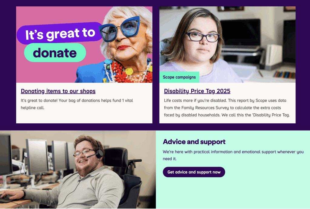
Here is what makes their approach so authentic:
- Striving for the highest standard. Scope aims for WCAG Level AAA wherever possible. This goes beyond legal requirements to offer the best possible user experience.
- Guided by clear principles. Simple mantras like “Made for all or none at all” shape every design decision and build a strong internal culture of inclusion.
- Committing to continuous improvement. They conduct formal accessibility audits every six months. This makes inclusion an ongoing process, not a one-time task.
- Driving change through procurement. Scope has a strict policy to only buy accessible software. This pushes their vendors and partners to prioritize accessibility, too.
- A “nothing about us without us” approach. They design with disabled people, not just for them. This ensures their solutions are practical, respectful, and truly meet user needs.
Taking the power of authenticity, Scope UK shows what is possible when accessibility is the central thread of an organization’s identity. Their work is a powerful reminder that the most effective and meaningful accessibility strategies come from a genuine, lived commitment to the community you serve.
6. World Wildlife Fund (WWF) – Clear communication
The World Wildlife Fund has the difficult task of communicating complex environmental issues to a worldwide audience. To succeed, their message must be clear, direct, and easy to grasp. Their website design reflects this core need, demonstrating that a commitment to simplicity not only helps their cause but also creates a naturally accessible experience for all users.
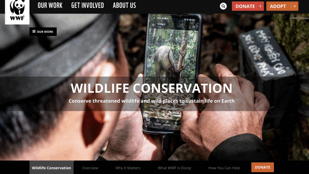
WWF’s focus on clear communication makes its site highly effective.
- A concise accessibility statement. Instead of a long document filled with legal jargon, WWF’s accessibility statement is straightforward and easy to understand. It clearly states their goals and provides contact information, making it easy for anyone to understand.
- Commitment to current standards. WWF commits to WCAG 2.2 Level AA. This shows they are keeping up with the latest best practices for digital inclusion.
- Clean design reduces cognitive strain. The website uses clean typography and a largely neutral color palette. This uncluttered visual approach creates a calm and focused reading experience, which is a significant benefit for users with dyslexia, attention deficits, or cognitive disabilities.
- User-centric and logical navigation. The site’s architecture is intuitive. The menus and page structures are organized in a way that makes sense to an average user, not just an internal employee. The predictability makes it easy to find information.
- An open channel for feedback. Like many accessible organizations, WWF provides a dedicated email address for accessibility issues, demonstrating their responsiveness and commitment to improvement.
For the World Wildlife Fund, simplicity in design is a powerful ally to accessibility. Their website is a strong reminder that an uncluttered, well-organized, and clearly written site is often the most effective way to deliver an important message to the widest possible audience.
7. Harvard University – Educational leadership
As one of the world’s leading universities, Harvard is a massive and decentralized institution. Thousands of faculty, staff, and students create digital content across countless departmental sites, making consistent accessibility a monumental challenge. Harvard’s solution is a masterclass in scale: they create a culture of accessibility through policy, education, and robust support systems.
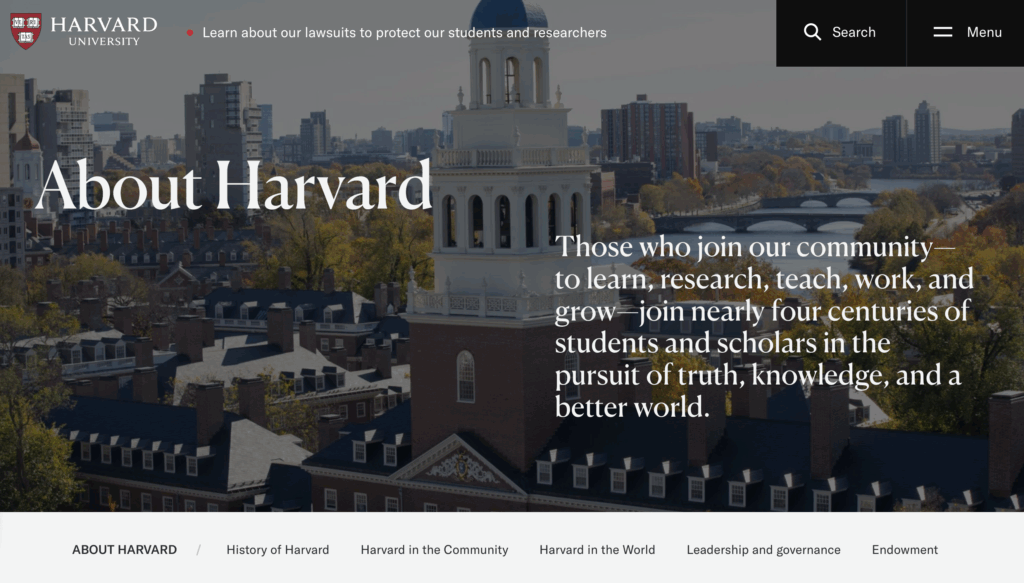
Here’s how Harvard empowers its vast community to build accessibly:
- A formal Digital Accessibility Policy. The policy sets a clear, non-negotiable standard for the entire university. It makes digital accessibility a shared responsibility for everyone.
- An extensive online resource hub. Harvard provides checklists, guides, and tools for creators at all skill levels. This makes it easy for anyone to create accessible content.
- Practical, hands-on training. They teach valuable skills like manual keyboard testing. This empowers people to find and fix accessibility issues on their own.
- Clear technical guidance for developers. For more advanced creators, Harvard provides detailed technical documentation on complex topics like the proper implementation of ARIA for web applications, ensuring technical excellence and consistency.
- Consultation with the disability community. The university’s accessibility team actively consults with and involves members of the disability community, taking into consideration the real-world needs and experiences of the people they are meant to serve.
Harvard shows how to achieve accessibility at scale. For any large organization with distributed teams, the most effective strategy is to invest in education. Provide clear policies, practical training, and easy-to-use resources to empower every individual to contribute to a more inclusive digital environment.
8. Microsoft – Enterprise scale
As one of the largest technology companies in the world, Microsoft’s products are a part of daily life for billions of people. This immense scale means their approach to accessibility has a widespread impact. Their strategy is a case study in how to operationalize inclusion, embedding it into the core processes of a massive organization so that it becomes a systematic and repeatable practice.
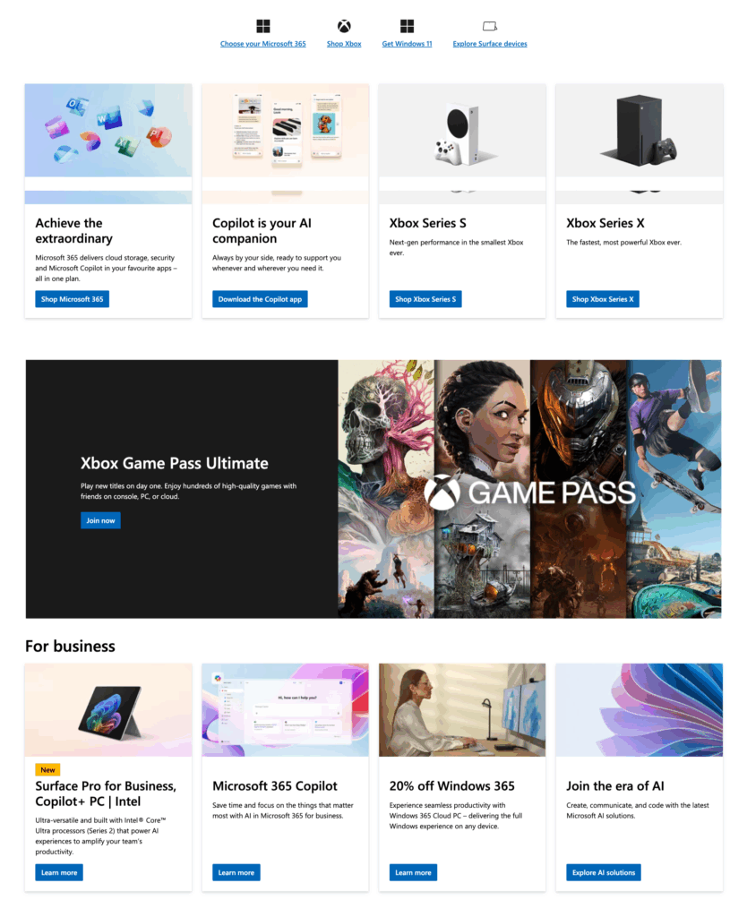
Here is how Microsoft builds accessibility into its systems:
- Accessibility integrated into the product lifecycle. Accessibility is not a final check. It is part of every stage, from initial design and development to testing and release.
- A publicly available Inclusive Design Toolkit. The company generously shares its knowledge with the world. Their Inclusive Design Toolkit provides free resources, activities, and methodologies that help other companies and designers learn to solve problems for one group and extend the solution to many.
- Regular accessibility-focused user research. To ensure their products work in the real world, Microsoft conducts ongoing user research specifically with people with disabilities. This provides them with direct, invaluable feedback that drives meaningful improvements based on lived experiences.
- Widespread internal training programs. The company invests heavily in training its vast workforce on accessibility fundamentals and best practices. This ensures that knowledge about inclusion is distributed throughout the organization, not isolated within a small team of experts
- Accessibility APIs for developers. Microsoft provides Accessibility APIs (Application Programming Interfaces) within its development platforms. These tools make it easier for third-party software developers to build accessibility features into their own applications, scaling Microsoft’s impact far beyond its own products.
The key takeaway from Microsoft is how to make accessibility a systematic process. For any large organization, lasting change requires building robust systems, processes, and tools that make it simple and natural for thousands of employees to consistently build inclusive products.
9. Target – E-commerce Excellence
Sometimes, the most significant progress begins with a major challenge. In 2006, a landmark lawsuit from the National Federation of the Blind challenged Target over the accessibility of its website. Rather than simply settling the issue, Target used the moment as a catalyst to completely overhaul its approach, transforming itself into a recognized leader in e-commerce accessibility.
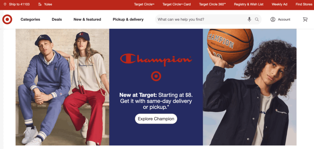
Their journey offers powerful lessons on becoming a leader in retail accessibility by implementing:
- An accessible and supportive checkout process. Target’s online checkout is a model of clarity. Forms are well-labeled, and when errors occur, users are given specific, helpful messages like “Please enter a valid ZIP code,” allowing them to easily correct mistakes and complete their purchase independently.
- Alternative text for all product images. In e-commerce, visuals are everything. Target ensures that all product images have descriptive alternative text, allowing a shopper using a screen reader to understand the appearance, color, and style of an item, which is critical for making a decision.
- Keyboard-navigable product galleries. Many e-commerce sites have image galleries that are impossible to use without a mouse. Target ensures its product galleries are fully navigable with a keyboard, allowing users to tab through different photos, zoom in, and explore items with ease.
- Screen reader-friendly price and availability information. The site is designed so that crucial information like price, sale status, and stock availability is clearly announced by screen readers. This ensures all customers have equal access to the most important shopping details.
This gives an idea of how Target effectively demonstrated that a company can respond to a difficult situation by fundamentally changing its culture to create a better, more inclusive experience for millions of customers.
10. Airbnb – Complex interactions made simple
Booking a trip online involves a lot more than reading information; it requires a series of complex interactions, from selecting dates on a calendar to browsing a map and messaging a host. These dynamic components are notoriously difficult to make accessible. Airbnb tackles these challenges head-on, proving that even a highly interactive platform can be designed for everyone.
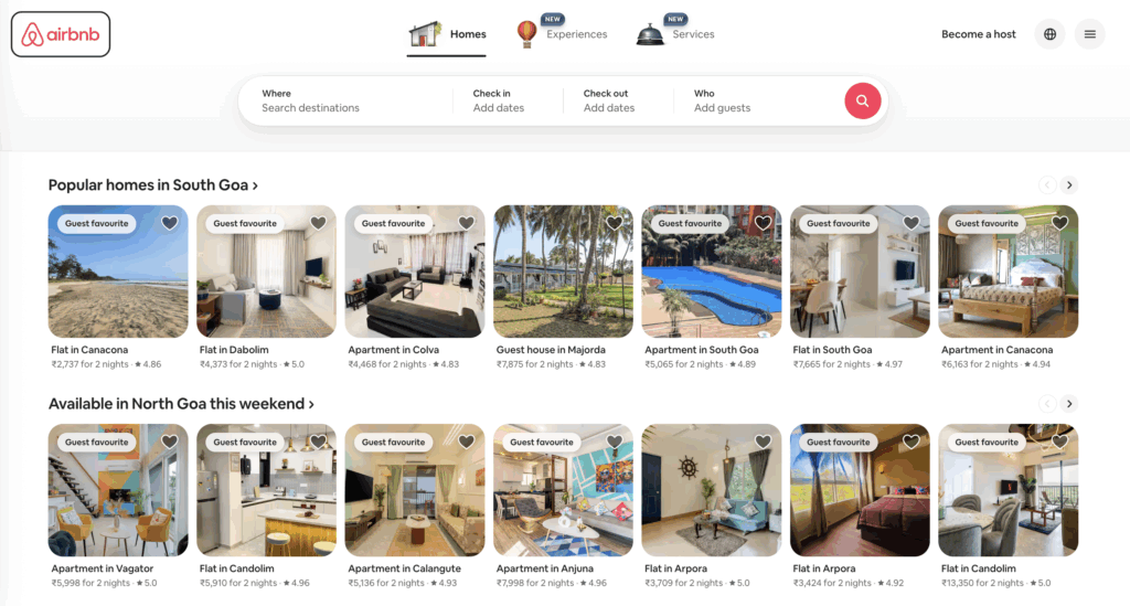
Airbnb’s website is an excellent study in making sophisticated features inclusive, with:
- A keyboard-friendly booking calendar. Online date pickers are often a major barrier for keyboard-only users. Airbnb has engineered a sophisticated calendar that is fully navigable with a keyboard, allowing a user to easily select check-in and check-out dates without needing a mouse.
- Accessible maps that provide alternatives. Interactive maps are inherently visual. To ensure this information is available to everyone, Airbnb provides text-based alternatives, like a list of properties that updates as the map view changes. This gives users who cannot see the map an equivalent way to browse and compare locations.
- Clear signposting during the booking process. A multi-step booking process can be confusing for keyboard users if they lose their place. Airbnb uses clear and highly visible focus indicators that outline which button or form field is currently active, acting like a “you are here” sign that prevents users from getting lost.
- An inclusive communication channel. The ability for guests and hosts to communicate is central to the Airbnb experience. Their messaging system is built to be accessible, with proper labels and controls so that a person using a screen reader can write, read, and manage conversations with ease.
- Lowering barriers with language support. By offering its platform in multiple languages, Airbnb directly supports cognitive accessibility. This reduces the mental effort required for non-native speakers to navigate the complex booking process, making it less stressful and more straightforward.
Complex functionality does not require a compromise on accessibility. Airbnb’s work serves as a powerful example that modern, interactive, and feature-rich web applications can be built from the ground up to be inclusive.
How Codeable can help
The best websites in the world prove that great design is accessible design. But turning that principle into practice is a challenge. It requires specialized skills that many teams don’t have, and fixing an existing site can be costly and complex.
Codeable provides direct access to pre-vetted WordPress experts who specialize in web accessibility. They can help you navigate the entire process, from initial audits to final implementation.
Our developers offer a full range of accessibility services:
- Comprehensive accessibility audits. Our experts use manual and automated testing to find and prioritize issues on your site.
- WCAG 2.2 compliance. We can fix existing problems to bring your site up to the latest accessibility standards.
- Custom accessible theme development. We build beautiful, custom WordPress themes with accessibility at their core from day one.
- Plugin and theme remediation. Our developers can find and fix accessibility barriers caused by third-party themes and plugins.
- Strategic consulting and training. We can help you build a long-term accessibility strategy and train your team to maintain it.
An accessible website protects your brand, expands your audience, and is the right thing to do. Don’t let a lack of in-house expertise stop you from building a better, more inclusive website.
Get a free estimate from a qualified Codeable accessibility developer today and start your project with confidence.
 Dream It
