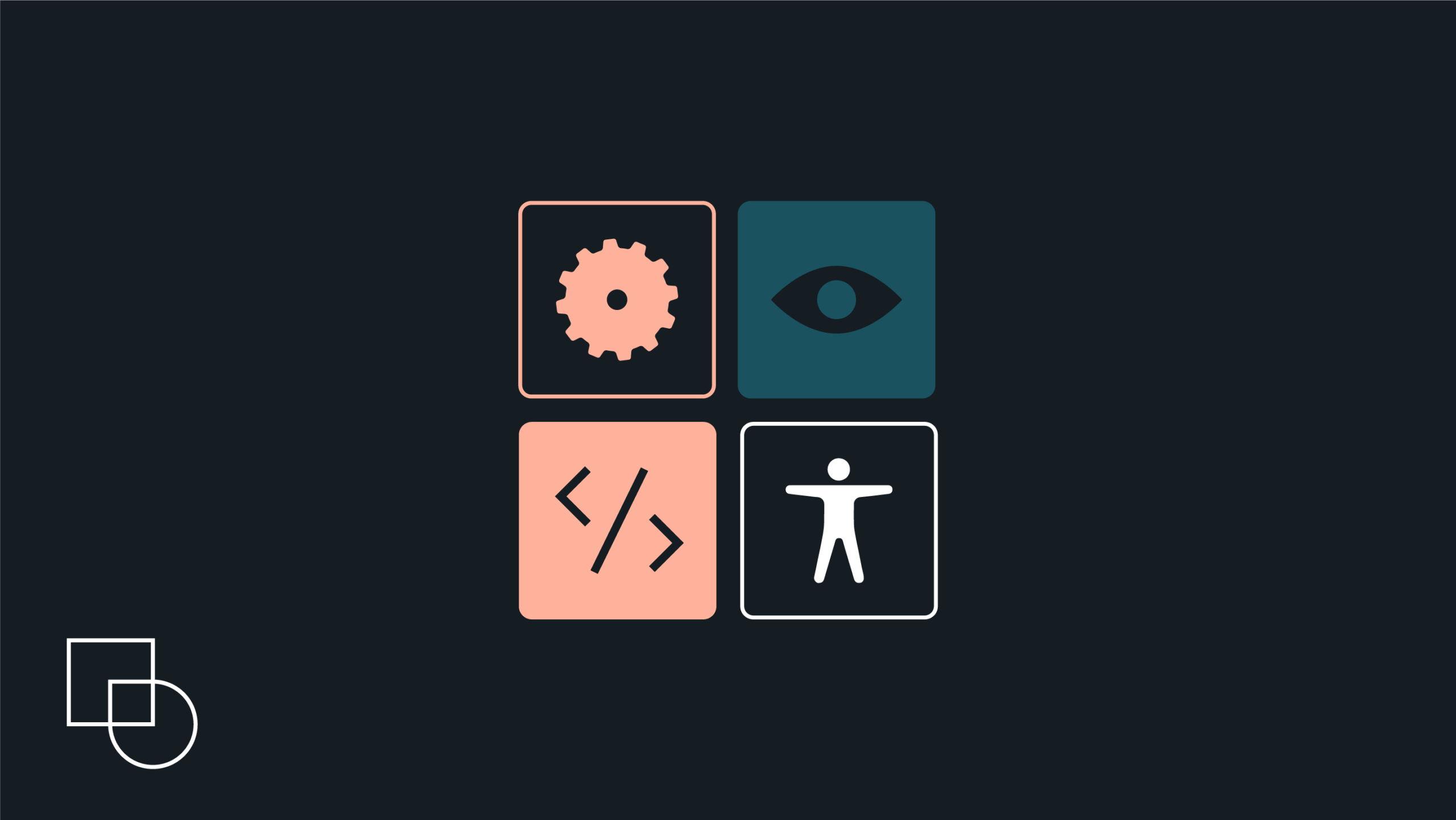
A web accessible frontend is the part of a website that users see and interact with, built so that people with different abilities can use it effectively. It means that anyone, whether they’re using a screen reader, navigating with a keyboard, or using voice commands, can access, understand, and engage with your content.
While legal standards and ethical considerations are part of the conversation, building an accessible site is fundamentally smart business. Accessibility practices are codified in global standards, such as the W3C’s Web Content Accessibility Guidelines (WCAG), which form the basis of accessibility legislation in many countries. The latest version, WCAG 2.2, continues to refine these principles.
Implementing these guidelines opens your website to a wider audience, leads to better search engine rankings, and creates a smoother, more intuitive experience for every single user, not just those with disabilities.
This article is your practical guide towards making accessibility a natural part of how you build for the web.
Get matched with the developer
that is perfect fit for your WordPress or WooCommerce needs.
Start a project
Essential front-end components for accessibility
Before diving into advanced techniques, it’s important to master the fundamentals. These core components are the building blocks of an accessible user experience. Getting them right from the start solves a huge number of common issues and provides a stable base for everything you build.
Semantic HTML: The bedrock of an accessible web
The most impactful thing you can do for accessibility is to use HTML elements for their intended purpose. This is called semantic HTML. When you use a <button> for a button, an <a> for a link, or a <nav> for navigation, you get a massive amount of accessibility for free. Browsers have built-in behaviors for these elements:
- They know a
<button>should be clickable with a mouse and operable with the Enter and Space keys. - They know an
<a>tag should be focusable with the Tab key. - They communicate the element’s purpose, or “role,” to assistive technologies like screen readers.
Choosing the right element is easier and more effective than using a generic <div> and trying to add accessibility back in with extra code. Beyond accessibility, using semantic HTML also offers several additional benefits. It can improve your site’s SEO, lead to better performance on mobile devices, and make your code much easier for other developers to read and maintain.
Structuring content for clarity and navigation
A well-structured page allows users to understand the layout and find what they need without getting lost.
- Landmark roles. Elements like
<header>,<main>,<nav>, and<footer>act as signposts. They define the major regions of your page. A screen reader user can use these landmarks to jump directly to the main content or the navigation menu, skipping over repetitive headers or ads. It’s the fastest way for them to get around. - Headings. Headings (
<h1>through<h6>) create a document outline. Screen reader users can pull up a list of all headings on a page to quickly understand its structure and jump to a specific section. To make this work, you must follow one simple rule: use headings in a logical, nested order. Always start with an<h1>for the main page title, followed by<h2>for major sections,<h3>for sub-sections, and so on. Never skip a level, like jumping from an<h2>to an<h4>, as this can make users think content is missing. - Consistent help. To reduce cognitive load, the WCAG 2.2 guideline on consistent help requires any help mechanism, like a “Contact Us” link or a chatbot, to appear in the same relative location on every page. If a help link is in the footer, it must be in the footer on all pages. This predictability ensures users can always find help without searching.
Crafting accessible forms
Forms are where some of the most important interactions happen. An inaccessible form can be a dead end for a user and a lost opportunity for a business.
- Labels are non-negotiable. Every form input needs a visible label. To connect them programmatically, the
<label>element’s for attribute must match the id of the<input>. This link is what allows a screen reader to announce the label when the user focuses on the input field. Placeholders are not a substitute for labels because they disappear once the user starts typing. - Grouping related controls. When you have a group of related options, like radio buttons for a single question, wrap them in a
<fieldset>element. Then, use the<legend>element to provide a question for the entire group. This gives screen reader users the context they need to understand the relationship between the options. - Clear error handling. Simply turning a border red isn’t enough to signal an error. An accessible approach involves a few steps. First, add
aria-invalid="true"to the input. Then, display a clear error message and programmatically link it to the input using thearia-describedbyattribute. For form-wide errors on submission, use a live region to announce a summary message like, “Your form could not be submitted because 2 errors were found.” - Layout. For most forms, a single-column layout is best. It creates a simple, predictable path for users to follow down the page. If a form is very long, break it into smaller, logical sections or multiple steps to reduce the mental effort required to complete it.
- Minimize redundant entry. Users shouldn’t have to re-enter information within the same process. For example, after a user enters their shipping address in a checkout form, you should pre-populate the billing address fields or provide a simple option to reuse the data.
- Ensure accessible authentication. A login process cannot rely solely on a cognitive test like memorizing a password or solving a puzzle. To comply with the Accessible Authentication rule, your forms must support password managers and allow users to copy and paste into username and password fields, providing a necessary alternative.
Images and alternative text
Alternative text (or alt text) is a short description that conveys the meaning and function of an image for people who can’t see it. Writing good alt text is about understanding an image’s purpose in the context of the page.
- Be descriptive but concise. Describe what’s in the image without adding redundant phrases like “image of…” or “picture of…”. A screen reader already announces that it’s an image.
- Describe the function. If an image is used as a link or a button (like a magnifying glass icon for search), the alt text should describe the action it performs (e.g.,
alt="Search"), not what it looks like. - Use an empty alt attribute for decorative images. If an image is purely for decoration and adds no real information, it should have an empty alt attribute:
alt="". This instructs screen readers to skip over it. A missing alt attribute is an error, but an empty one is a deliberate choice.
Ensuring keyboard operability

A core principle of web accessibility is that anything you can do with a mouse, you must also be able to do with a keyboard. Many users with motor disabilities and all screen reader users rely on this.
- Logical focus order. The order in which interactive elements receive focus when a user presses the Tab key should be logical and predictable. It should follow the visual flow of the page, typically from top to bottom, left to right. This usually happens naturally if your HTML is structured logically.
- Visible and unobscured focus. When an element is selected with the keyboard, browsers display a visual outline around it. Some website designs remove this outline, which is a major accessibility problem.
- The modern solution is to use the CSS
pseudo-class :focus-visible. This lets you create a highly visible focus style that only appears for keyboard and assistive technology users, providing the clarity they need without altering the experience for mouse users. - The new WCAG 2.2 guideline on Focus Not Obscured (AA) takes visibility a step further. It requires that your highly visible focus indicator is not completely hidden by other page elements. When a user tabs to an element, it must remain at least partially visible and not be covered by things like sticky headers, cookie banners, or pop-up chat widgets. A focus indicator is useless if it’s hidden.
- The modern solution is to use the CSS
- Using tabindex correctly. The tabindex attribute controls whether an element can receive keyboard focus. It should be used carefully:
tabindex="0"allows an element that isn’t normally focusable (like a<div>turned into a custom button) to be included in the natural tab order.tabindex="-1"lets an element receive focus from your code (with JavaScript), but removes it from the natural tab order. This is useful for managing focus in things like modal dialogs.- Avoid positive values (
tabindex="1",tabindex="2", etc.). Using a positive tabindex creates a separate, rigid tab order that overrides the natural document flow. This is almost always confusing for keyboard users and is considered an anti-pattern. The right solution is to arrange your HTML in a logical order.
Designing for touch and pointers
As the use of mobile devices and varied input methods increases, ensuring your site is easy to use with more than just a perfect mouse pointer is crucial. The latest WCAG 2.2 guidelines introduce two key criteria that directly address this.
First is Target Size (Minimum). This rule requires that interactive elements like buttons, icons, and links have a target area of at least 24×24 CSS pixels. This is highly important for users with motor impairments who may have difficulty with precision, and it vastly improves the experience for everyone on a touchscreen by preventing frustrating mis-taps.
Second, the Dragging Movements criterion states that any action relying on a dragging motion must have a single-pointer alternative. Think of a drag-and-drop file uploader; it must also include a simple “Browse” button. A range slider should have clickable icons to increase or decrease the value. This ensures that users who cannot perform complex gestures, irrespective of whether they use a keyboard, voice control, or other assistive tech, are not locked out of key functionality.
Enhancing semantics: When to use (and not use) ARIA
While using standard HTML elements correctly will handle most of your accessibility needs, modern web applications often contain complex components that don’t have a simple HTML equivalent, such as tabbed interfaces, auto-completing search bars, or pop-up modal windows. This is where ARIA is essential.
What is ARIA?
ARIA, which stands for Accessible Rich Internet Applications, is a set of attributes you can add to your HTML tags. Its job is to provide extra information to assistive technologies, making dynamic content and custom components understandable.
You can think of ARIA as providing stage directions for a play. It doesn’t change the actors (the HTML elements), but it tells screen readers what the actors are doing, what their role is, and how their status has changed.
The first rule of ARIA: Use native HTML first
This is the most important guideline for using ARIA, and it’s very simple: if you can use a native HTML element or attribute that already has accessibility built in, do it.
Before adding an ARIA role, ask yourself, “Is there a standard HTML tag for this?”
If you need a button, use <button>. If you need a checkbox, use <input type="checkbox">.
These elements already know how to work with keyboards and communicate their purpose to screen readers. Creating a button from a <div> and adding ARIA requires more code and introduces more opportunities for mistakes.
Remember this community mantra: no ARIA is better than bad ARIA. Incorrectly implemented ARIA can make your website less accessible than if you had used none at all, creating confusion and frustration for users.
Common ARIA anti-patterns and pitfalls
ARIA is a powerful tool, but it’s easy to misuse. Watch out for these common mistakes that can break the user experience.
- Redundancy. Avoid adding ARIA roles that are already implied by the HTML element. For example, writing
<button role="button">is unnecessary because a<button>element already has the role of a button. This just adds clutter to your code without providing any benefit. - Forgetting behavior. A very common mistake is to apply an ARIA role and assume the work is done. ARIA only changes an element’s meaning, not its function. If you add
role="button"to a<div>, you must also write the JavaScript to make it work like a button. This includes making it focusable withtabindex="0"and making it respond to Enter and Space key presses. - Misusing aria-hidden. The attribute
aria-hidden="true"removes an element (and everything inside it) from the accessibility tree, making it invisible to screen readers. Never apply this to an element that can still receive keyboard focus. Doing so creates a “ghost” control. A keyboard user can tab to the element, but the screen reader will say nothing, leaving them stuck on an invisible control with no idea what it is. - Incorrect syntax. Assistive technologies are not forgiving of typos. Simple mistakes like misspelling an attribute (e.g., aria-labeledby instead of aria-labelledby), using the wrong case for a role, or providing an invalid value will cause the attribute to be completely ignored. Your intended accessibility feature will simply not work.
Sustainable accessibility: Choosing the right framework and tools
Building accessible websites is not a one-time task, but rather a continuous practice that should be part of your entire development process. The tools you choose, from front-end frameworks to testing software, can make this practice either a smooth part of your workflow or a constant challenge.
Here’s how frameworks influence accessibility:
While the core principles of accessible HTML and ARIA are universal, the front-end framework your team uses can heavily influence how easy it is to put them into practice.
Think of a framework as a pre-stocked workshop. Some give you highly specialized tools with built-in safety features, while others provide raw materials and expect you to bring your own expertise.
The architecture and ecosystem of a framework can either guide you toward accessible patterns or allow common mistakes to slip through.
A comparative look at popular frameworks
Each popular framework has its own philosophy and features that impact accessibility.
React
As a library, React gives developers a lot of flexibility, which means the responsibility for accessibility falls heavily on the team. However, its powerful ecosystem offers excellent support. Features like JSX make it easy to write semantic HTML, and Fragments help you avoid adding extra <div> elements that can break a page’s structure for assistive technologies. The community provides top-tier tools like eslint-plugin-jsx-a11y for catching errors as you type and accessible component libraries like MUI and React Aria.
Angular
This opinionated framework provides a more structured path to accessibility. Angular has a specific syntax, [attr.aria-label], for binding to ARIA attributes, which helps reinforce correct implementation. Angular’s biggest advantage is its official Component Development Kit (CDK), which includes a dedicated accessibility package with tools for managing focus and making live announcements to screen readers. Its official component library, Angular Material, is also built with accessibility as a top priority.
Vue.js
Known for being approachable, Vue.js‘ template syntax feels very much like standard HTML, making it intuitive to write semantic code. The Vue community maintains helpful tools like eslint-plugin-vuejs-accessibility to check for common errors during development. For pre-built components, libraries like Nuxt UI explicitly promote their strong, out-of-the-box accessibility features.
Svelte
Svelte has a unique and powerful advantage – it’s a compiler. This means it can check your code for accessibility issues before it even runs. As you build your components, Svelte can provide compile-time warnings in your terminal for common mistakes like missing alt text on an image, using autofocus in a disruptive way, or applying redundant ARIA roles. This immediate feedback is a fantastic way for developers to learn and prevent errors from the very start.
Integrating accessibility into the development lifecycle
Optimizing website design for accessibility needs to be a routine part of how your team works, not a final step before launch. This is achieved by combining automated checks with essential human verification.
Automated testing
Automated tools are great for catching the low-hanging fruit. They can quickly scan your code for clear, programmatic violations like missing labels or insufficient color contrast.
- In-project tools like Axe-core can be built directly into your testing frameworks (like Jest or Cypress). You can write tests that fail if a new component introduces an accessibility violation, preventing regressions before they happen.
- CI/CD integration is the next step, where these automated checks are run every time a developer tries to merge new code. A failed accessibility test can block the code from going into production, elevating accessibility to the same level of importance as any other critical bug.
- Browser auditors like Google Lighthouse (built into Chrome) can run a quick audit on any page and provide a high-level score and report.
The necessity of manual testing
It’s important to understand that automated tools can only detect about 30-57% of all potential accessibility issues. They can tell you if an image has alt text, but they can’t tell you if that text is meaningful.
That’s why manual verification is non-negotiable. When automation handles the easy-to-find errors, you free up human testers to focus on the nuanced experience issues that only a person can evaluate.
- Keyboard-only testing. This is the single most important manual check. Try to use your entire website using only the Tab, Shift+Tab, Enter, Space, and arrow keys. This quickly reveals whether all interactive elements are reachable, if the focus order is logical, and if there is a visible focus indicator.
- Screen reader verification. The only way to truly understand the experience for a visually impaired user is to test with a screen reader. Using tools like NVDA (for Windows), JAWS (for Windows), or VoiceOver (for macOS) will confirm if your content is read in a logical order and if your ARIA implementations are actually working as intended.
Ensure front-end accessibility with Codeable
Building an accessible website is an achievable goal. But even with a clear roadmap, navigating the technical details and compliance standards can be a challenge, especially when you’re facing a tight deadline or working with a complex, existing site.
Sometimes, the most effective path forward is to bring in an expert guide.
Codeable can connect you with top-tier developers who have specialized, verified experience in web accessibility. We’ve already vetted them for you, so you can trust that you’re working with a professional who understands the difference between simply passing an automated test and creating a genuinely usable experience for everyone.
Our accessibility experts can help you:
- Build new applications from the ground up. Work with a developer who can create an accessible foundation from the very first line of code, preventing costly fixes down the road.
- Audit and remediate existing websites. A Codeable expert can perform a deep audit of your current site, identify the root causes of accessibility issues, and create a practical plan to bring it up to standard.
We ensure that your website meets the highest standards of quality and complies with all international accessibility guidelines. Protect your brand, expand your audience, and build a website that offers a better experience for all of your users.
Tell us about your project to get a free estimate from a vetted accessibility expert today.

20 000+ businesses of every shape and size have already trusted us to hire WordPress developers and scale their growth.
 Dream It
